


The importance of iteration
Historically, workplaces haven’t been designed in an iterative way. Corporate real estate teams often sign 20-year leases with design elements that remain static for what can seem like forever.

That’s changing. With new office options like WeWork, leases are shorter term and workplace design is increasingly flexible. In that spirit, we decided to mix it up a bit at our HQ in San Francisco.
A homegrown experiment
All good workplace experiments begin with observation. You hear rumblings that employees can’t find a room to meet, but as far as you can tell, conference rooms are almost always available. That beautiful lounge you invested in rarely looks full... The list goes on.
The hunch
In our case, we began with a hunch: one of our meeting rooms appeared chronically empty, but we had no idea how often or why. We figured some design and layout changes may encourage more people to use it.
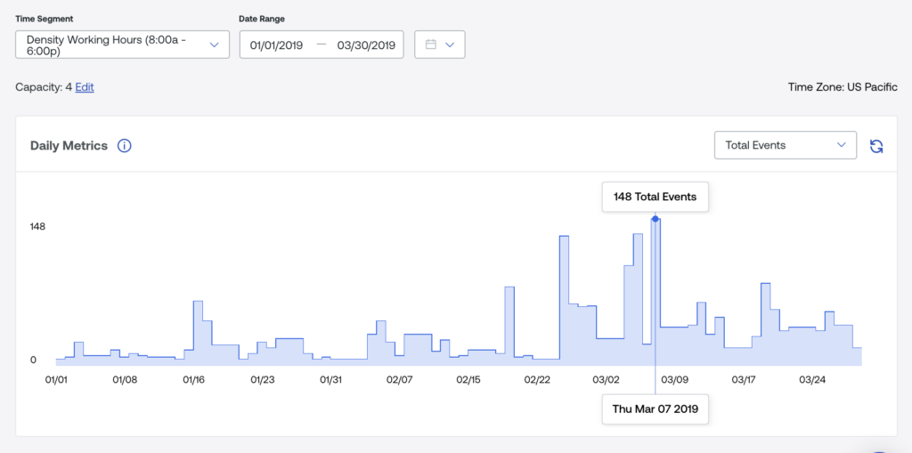
Workplace utilization data FTW
With the average San Francisco rent at $80 per square foot, we were wasting $1,000 a month on just one room.
To get a baseline understanding of how often the room was used, we pulled a utilization report from our Density dashboard. The Density dashboard leverages data from Density to show how many people visited a space at any given time.

What we saw confirmed our observation: this room was significantly underutilized. The room was designed for four people, but in a typical workday, the room was empty or used by just one person for 96% percent of the workday. With the average San Francisco rent at $80 per square foot, we were wasting $1,000 a month on just one room.
The makeover
It was clear we had work to do. Like most conference rooms, the space was designed for video conferencing. We wanted to incorporate design elements that would also encourage in-person group meetings.

Based on a tip from our friends at Knoll, we believed that informal, lounge furnishing would encourage more than two people to use the space at a time. We brought in furnishings that were in other lounge areas of the office, including a plant, lamp and soft seating.

The Verdict
“It’s really nice in there, I love it!” - Matt Merati, Density employee
We explained to our coworkers that we changed the design of the room and that it was available as a resource for them to use. Just days after the announcement, utilization patterns dramatically changed.
To gather more data, we extended the study. After one month, the trend continued to show people really liked the new space design.

The room became a clear favorite for three to four person meetings. An employee on the marketing team, Dave Farah, explained that meetings held in the room were more relaxed, and it seemed easier to listen to others. Matt Merati, who works on the Density algorithm team, exclaimed, “It’s really nice in there, I love it!” One quarter after the makeover, we considered the experiment a success. It had 246% more visits in the past quarter than in the previous quarter.
Takeaways
While limited in scope to just one room, our exercise illustrates some important points for the evolving nature of workplace design.
- Adopting an iterative, scientific mindset for testing workplace design doesn’t need to be overly complex. It can start small and expand from there. In our case, we started with room and one hypothesis.
- Different design elements encourage different employee behaviors. In our case, employees said they enjoyed more in-person collaboration compared to when the space was set up for a conference room.
- Changing design doesn’t mean an expensive overhaul. It can be as simple as adjusting furnishings.
- A design that works well at one company, won't necessarily work at yours. Keys for success: access to accurate utilization data and a willingness to experiment and learn.
- Utilization data should complement, not replace, employee feedback. It’s always important to listen to employees.