How Heatmaps saves you from unneeded plane rides
Heatmaps helps you replay a day in the life of a space and avoid plane rides to go and actually visit a space yourself.

How do you know if a space is used effectively? How do you identify opportunities to optimize your square footage?
In the past, the only way to answer these questions was to physically visit the location and observe the activity — hardly a scalable or objective method.
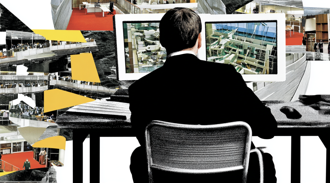
Enter Heatmaps, found inside our platform Atlas.
Heatmaps replays a day in the life of your space. You can see what’s happening across your entire real estate portfolio — from the number of people coming into the office to the impact on meeting rooms and desks — right from your laptop.

How we use Heatmaps to understand and improve our cafe space
The cafe in our San Francisco headquarters is one-fourth of our entire office. With so much square footage dedicated to this space, we’re always looking for ways to maximize its ROI.
Below is how we use Heatmaps to understand how the cafe is used and uncover ways to increase its utility.
First, we zoom in on a typical week here at HQ (for context, as part of our RTO initiative, employees come to the office on Mondays, Wednesdays, and Thursdays). We then unlock the Heatmaps view, which allows us to scroll through every hour of every day and look at the activity on the floor.

Our heatmap uncovers that while there is significant activity throughout the other spaces in the office — desks and meeting rooms in particular — the activity in the cafe area is rather low, especially outside lunch hours.
Many of our customers share similar experiences within their workplaces — certain spaces go underused for hours each day.
We can make an observation, such as “Why is no one working from the cafe?”. Our local ops team will get notified, which kicks off a meaningful conversation — rooted in data — around how best we can optimize this space for better utilization.
But our work isn’t done.
Scanning through our Floor Occupancy trend chart also helps us see anomalies — in this case a spike in office utilization. The heatmap for that week shows periods of much higher activity in the cafe — beyond normal lunch hours.
This is an anomaly that we’re interested in.

Again, we can add an Observation, asking our local team what they did to attract people to the cafe space. They can respond, within Atlas, giving us an idea of how to make the cafe more attractive during a typical week when there is no offsite.
Dig deeper with Heatmaps
Where did people go? What assets did they rely on? Where did they linger? Are they gathering as teams or focused on individual work? What spaces are untouched? These are questions you can now answer without an on-site visit.
Learn more about Heatmaps — and our platform Atlas — by watching our 2-minute overview below.
Key Takeaways

DisruptCRE founder shares how corporate real estate is changing
Companies are moving employees from underutilized offices into "space as a service” options with utilization data.
Watch now
Half of offices are empty but you still can’t find a meeting room
Employees waste up to 30 minutes a day looking for a meeting room to meet in workplaces.
Read moreMost recent
The truth behind “99% accurate” occupancy sensors
Accuracy in occupancy sensing depends on the type of space and situation you’re measuring—not a flat percentage claim.


Privacy and occupancy sensors: 3 practical realities to face
The right occupancy sensors count people while respecting privacy and shielding companies from costly security breaches.

Battery-powered sensors: New hype, same problems
Sensors with batteries decay over time. Learn why real-time occupancy data still demands a wired, scalable solution.
Explore other Density Products
Atlas for Workplace
Insights for the workplace that help you cut costs and deliver better spaces.
Learn more